Make the space more flexible
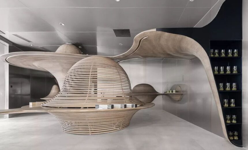
Since the ancient mountains have a good tea, the high mountains at 1,500 meters above sea level have created the taste of tea. The inspiration for the Yunye space in the Zhuyeqing Experience Store is derived from the natural ecology of the origin of the mountain tea.
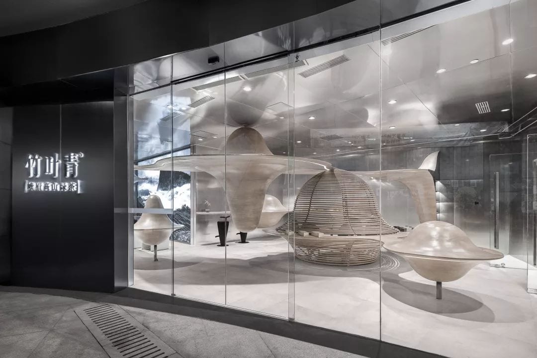
In less than 100m2 of space, the designer is shaping both the scene and the scenery—the beautiful and beautiful mountains, the mists and clouds that are lingering all the year, which can be visualized in the space.
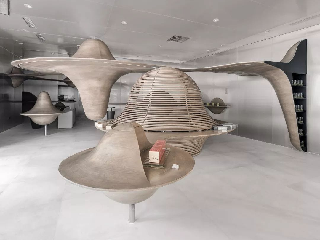
Around this theme, the designer first outlined the continuous mountain shape in the enclosed space, opening the entrance to the natural wonderland.
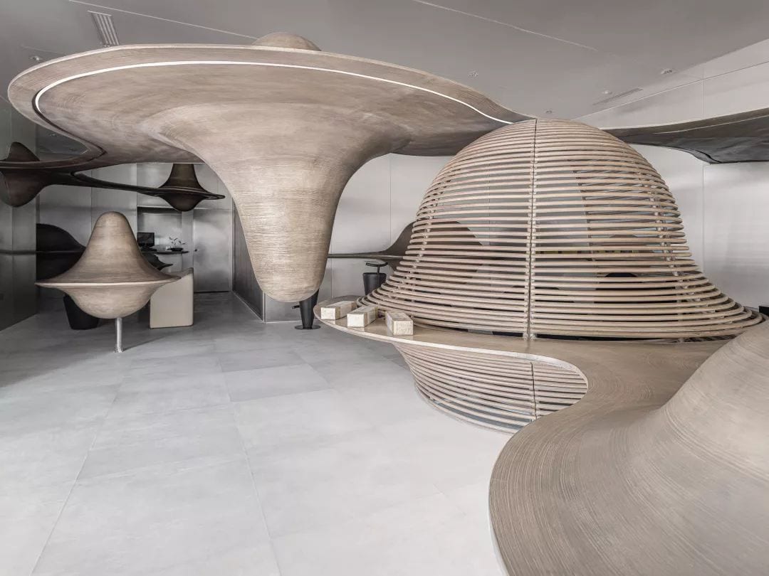
Then the designer inverts the mountain shape by means of the reflection image, and transforms the mountain into a cloud through the integration of high and low size.
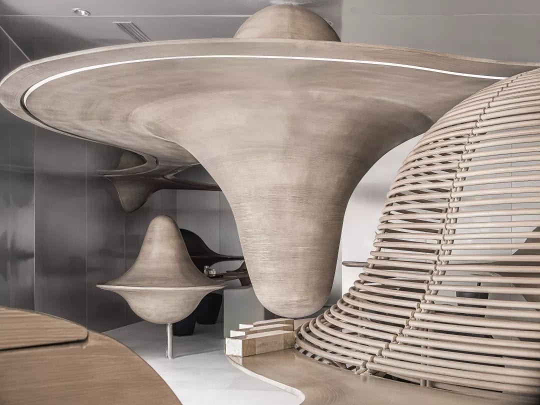
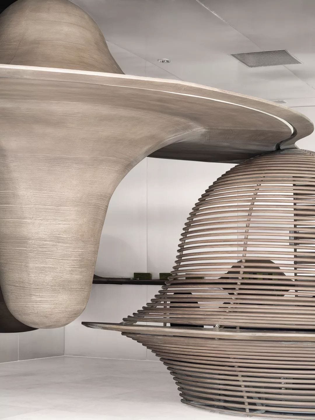
If it is just landscaping, there will be countless ways of expressing Li’s eclectic style. For the Yunshan space, the device suspended in the air not only shapes the rich composition of natural aesthetics, but also satisfies the function of product placement. Demand provides consumers with a variety of viewing angles. It also includes designers’ multidimensional thinking about the new retail space.
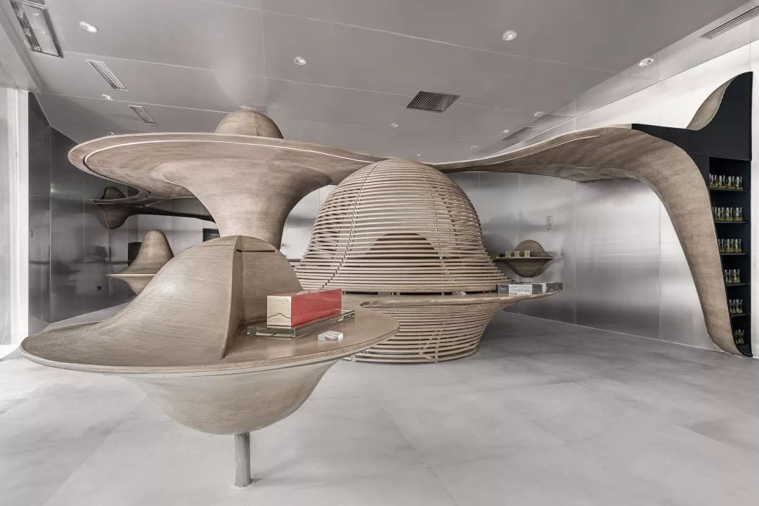
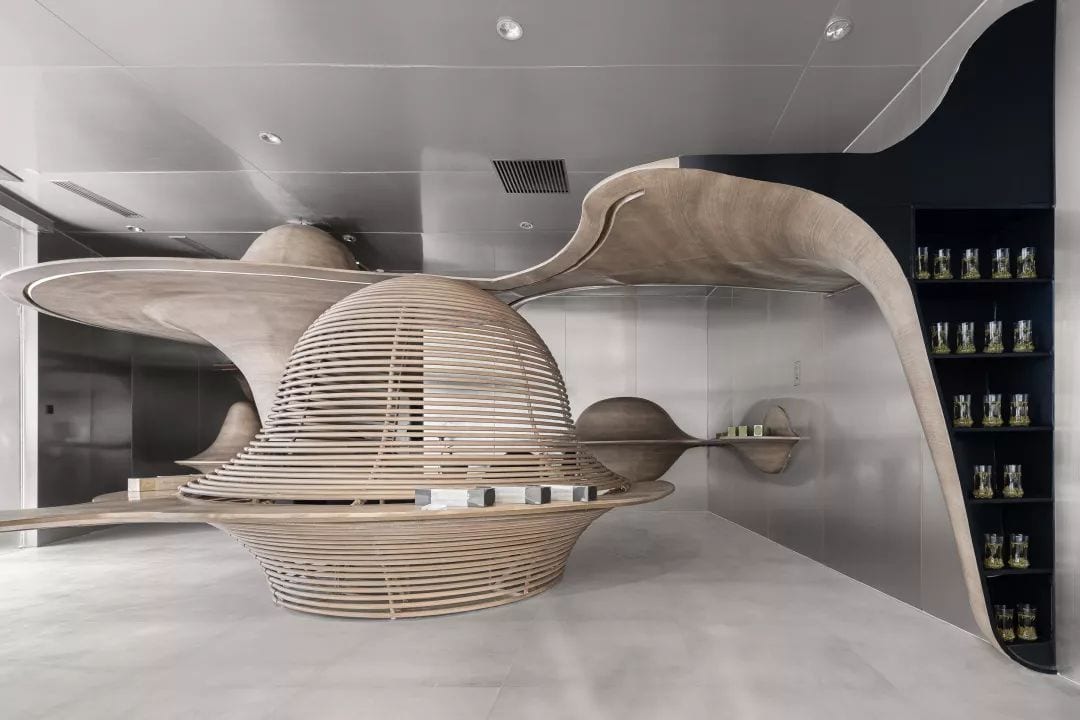
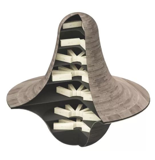
The designer integrates the functions of the display goods into the “Cloud Mountain” of the space, and provides the product display on the platform in a finishing touch, perfectly blending the consumption scene and the experience scene.
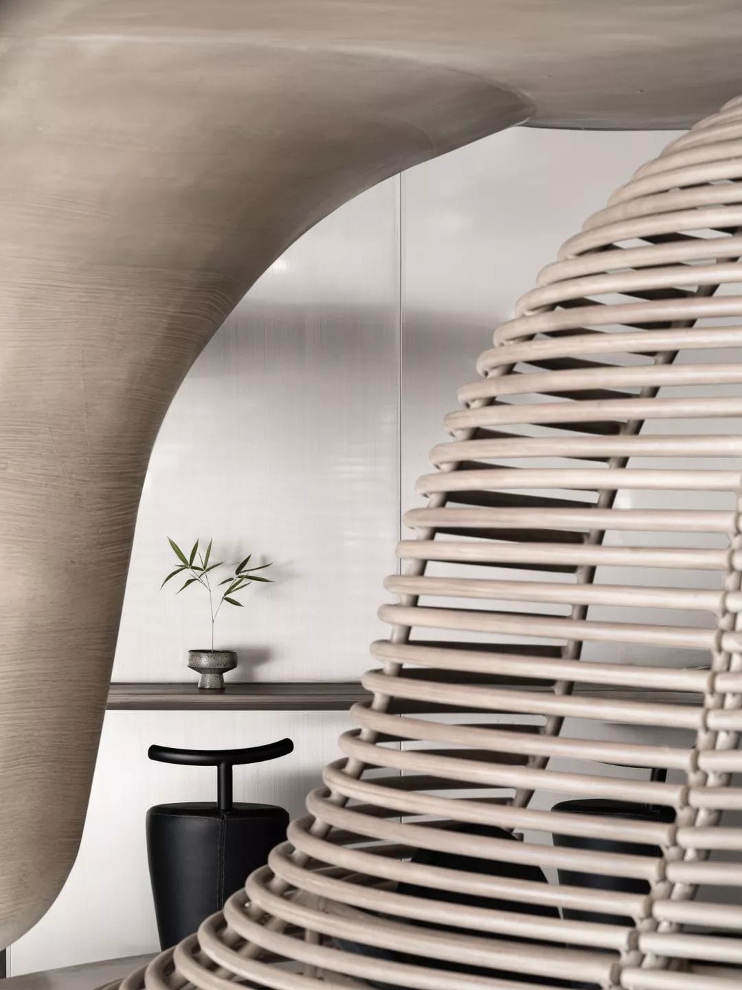
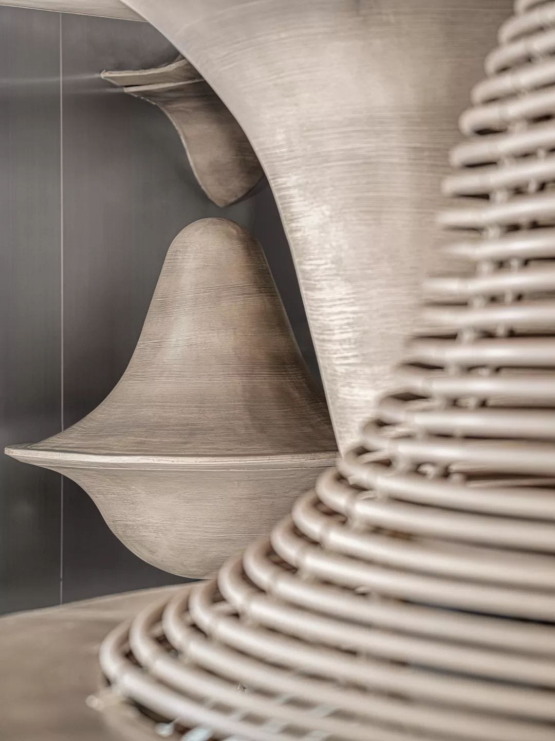
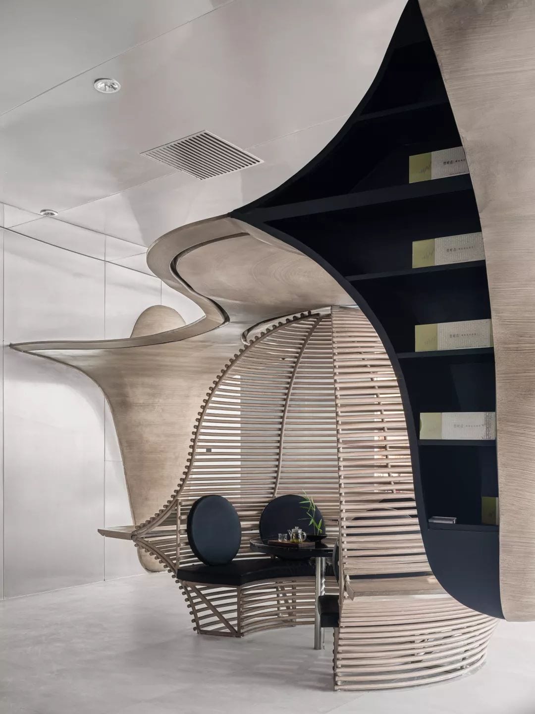
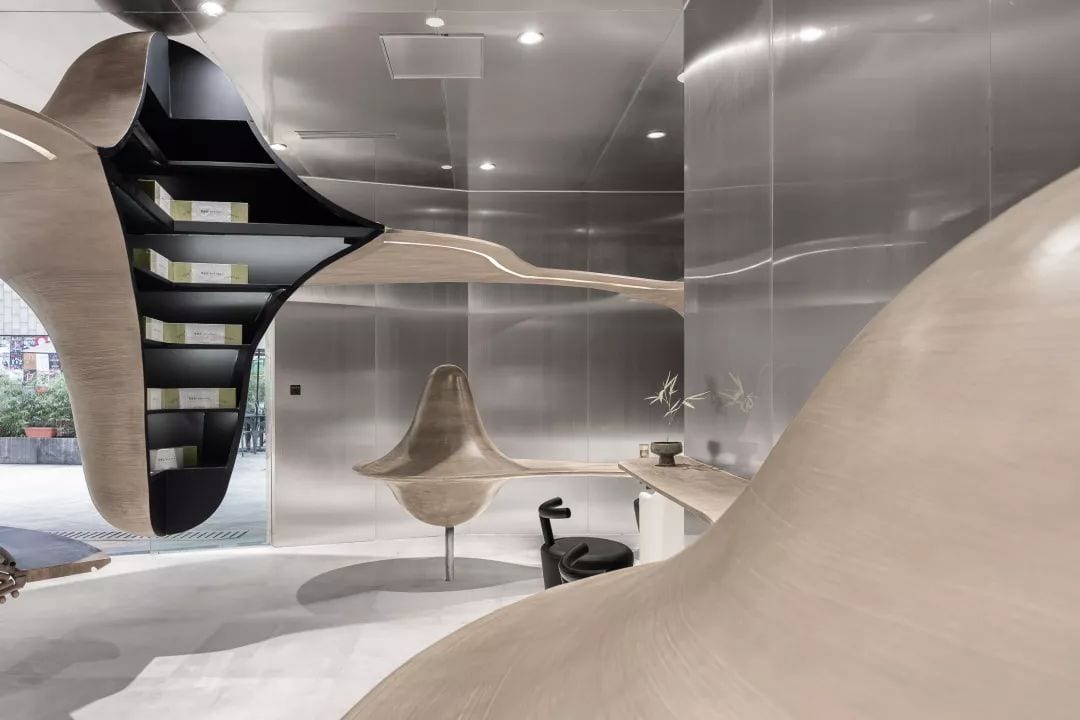
The selection and use of materials is also a place where Li Xiang has a unique inspiration for the bamboo leaves in Qingyun Mountain. The black stainless steel material bears the skeleton and display frame in the space, while the wood veneer gives the Yunshan a warm tone. The conflict and integration of the two textures make the temperament of the space richer, both natural and modern poetry.
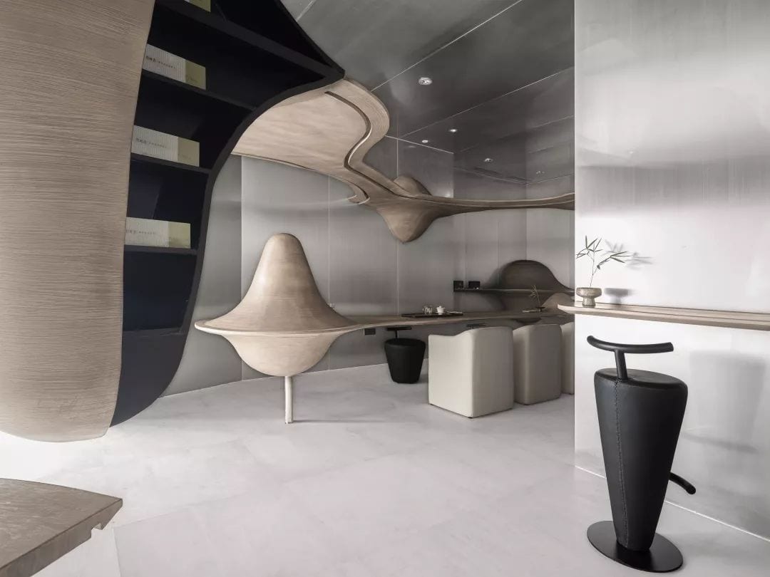
The sense of style that metal and wood color collide with adds a different visual experience to the entire space.
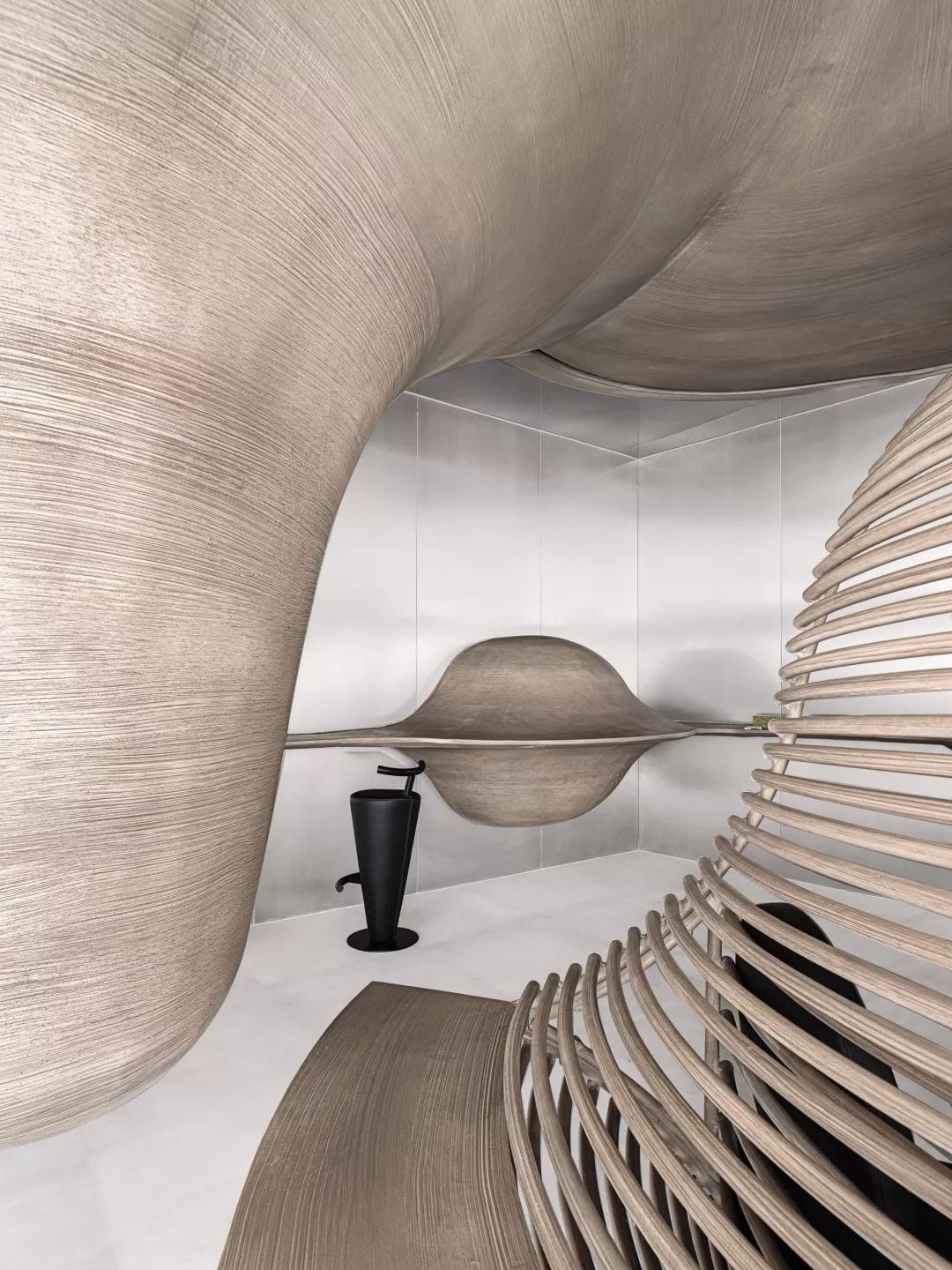
The white artificial stone floor grinds out the ethereal background that perfectly interprets the theme of “Yunshan”, blurs the scale and boundary of the storefront, and allows a series of intentions around the tea to flow freely in the space.
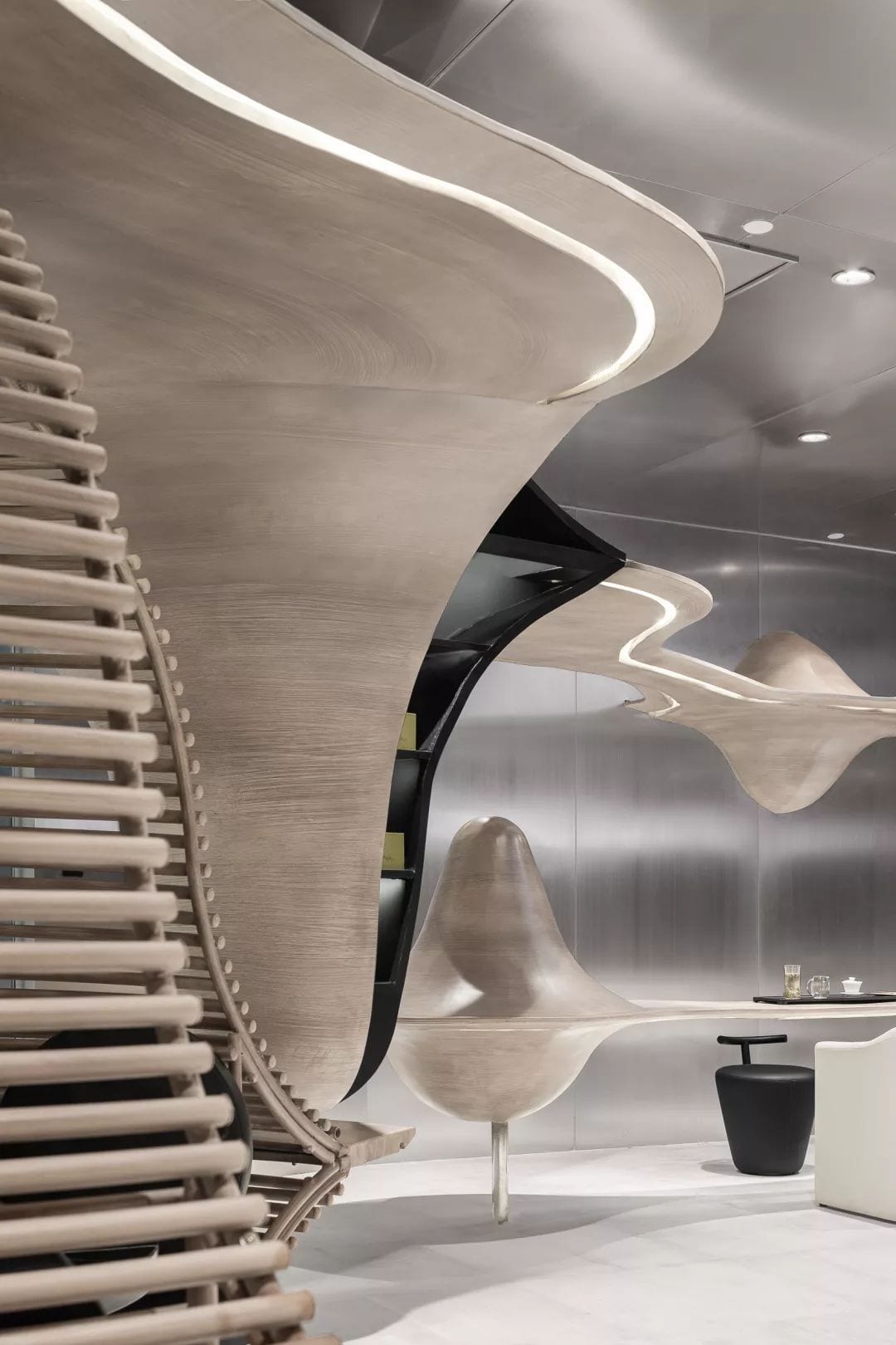
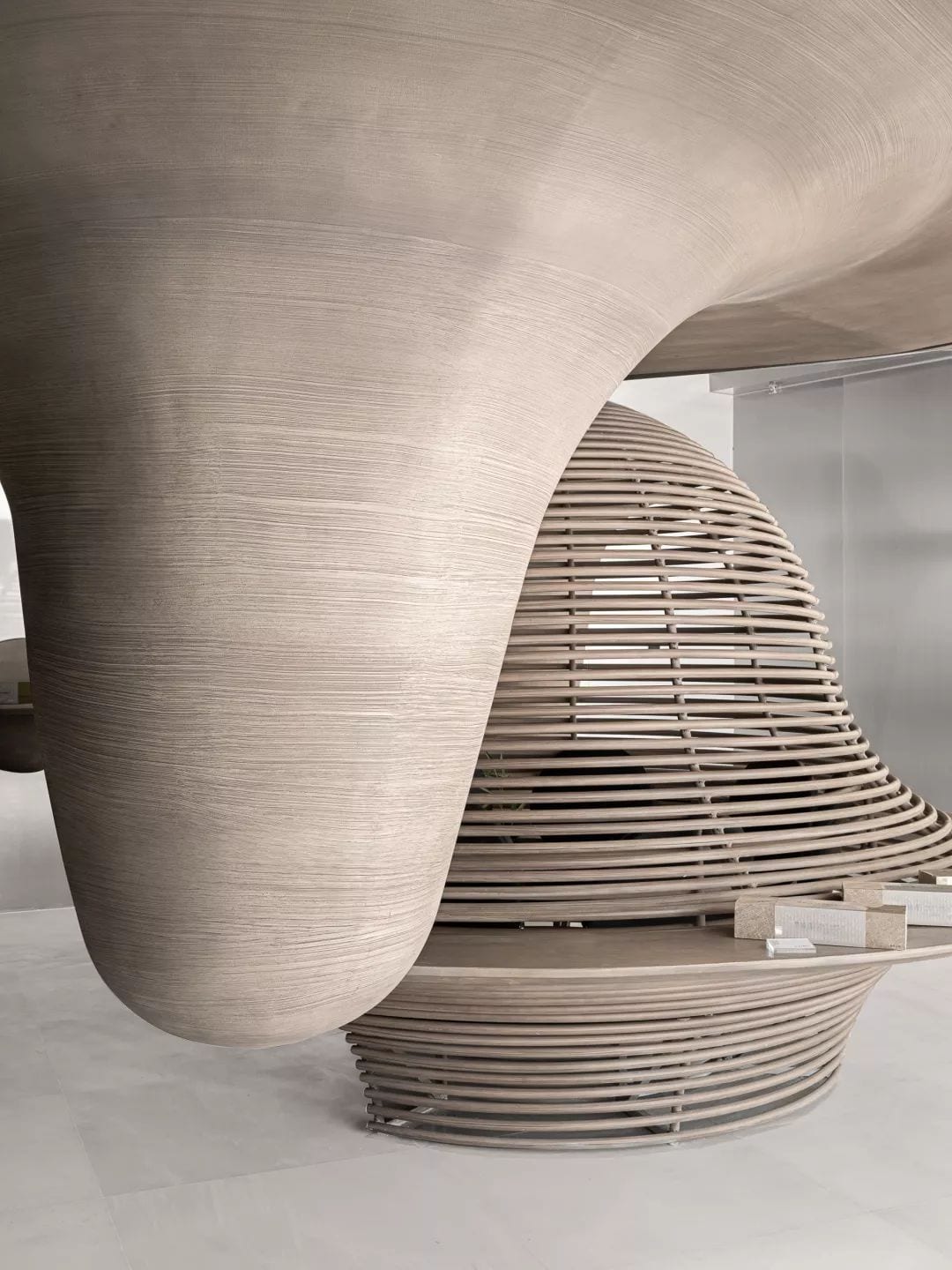
Different from the “color wonderland” style that has long been known, this time, Li Yun’s “Yunshan Space”, with the spirit of the mountains, to the cloud, is isolated from the dust, and the fun of landscaping and creation is natural. Smart.



Hey there, You have done an excellent job. I’ll certainly digg it and personally suggest to my friends. I am confident they will be benefited from this web site.
Its like you read my mind! You appear to know so much about this, like you wrote the book in it or something. I think that you can do with a few pics to drive the message home a bit, but other than that, this is great blog. A great read. I’ll definitely be back.
What a information of un-ambiguity and preserveness of valuable experience on the topic of unexpected emotions.