Simple aesthetic idea model house design
Simple aesthetic idea model house design
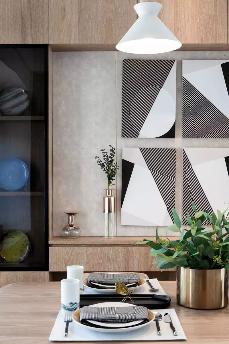
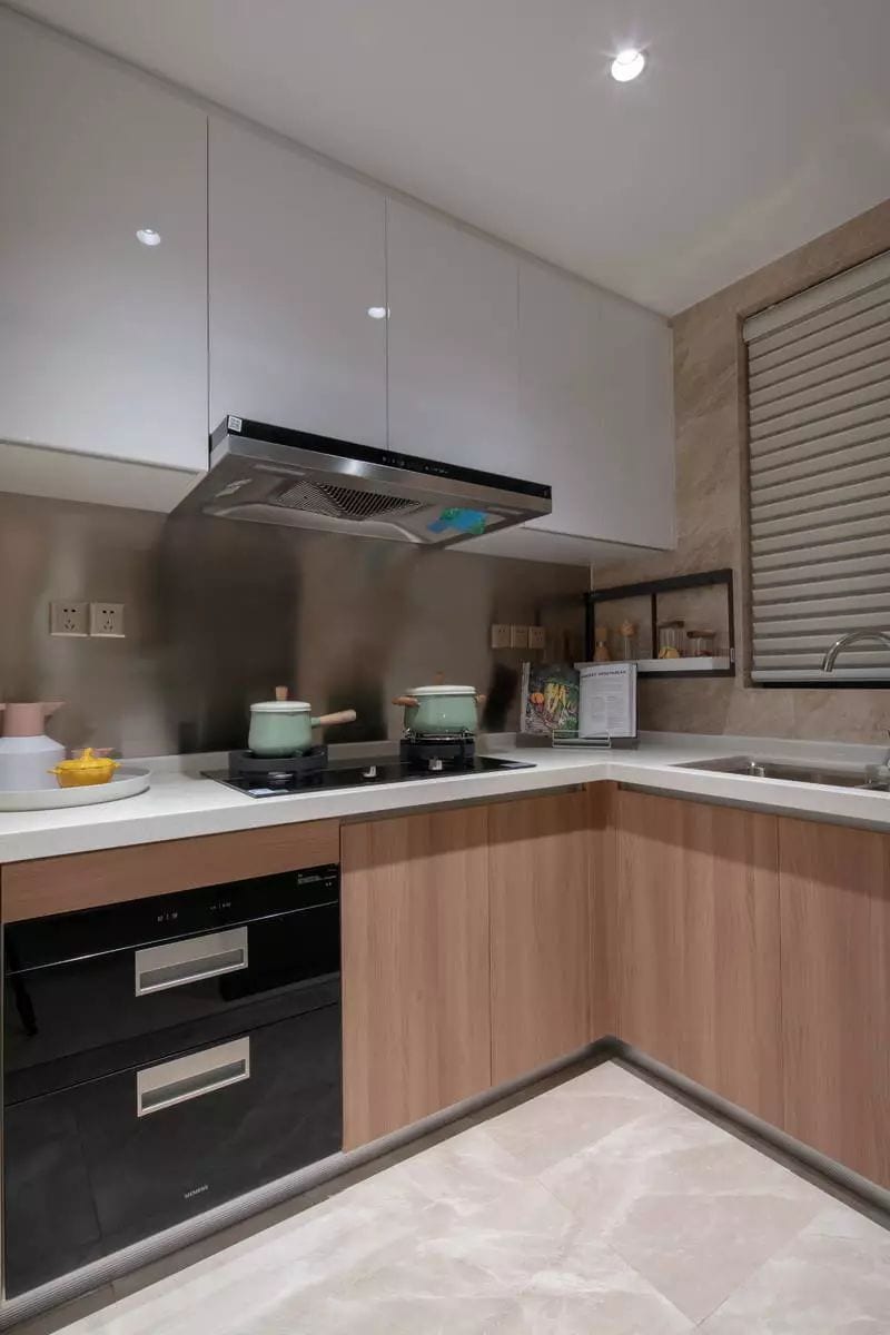
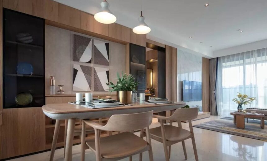
The design of this case advocates the aesthetic idea of simplicity, and the space form and interface pursue the beauty of simplicity and cleanness. In addition to a small amount of glass, mirror and the application of thin color plated steel at the end, the whole space is paved with the warmth of wood, making the home appear light and soft, creating a warm and full of life atmosphere home space.
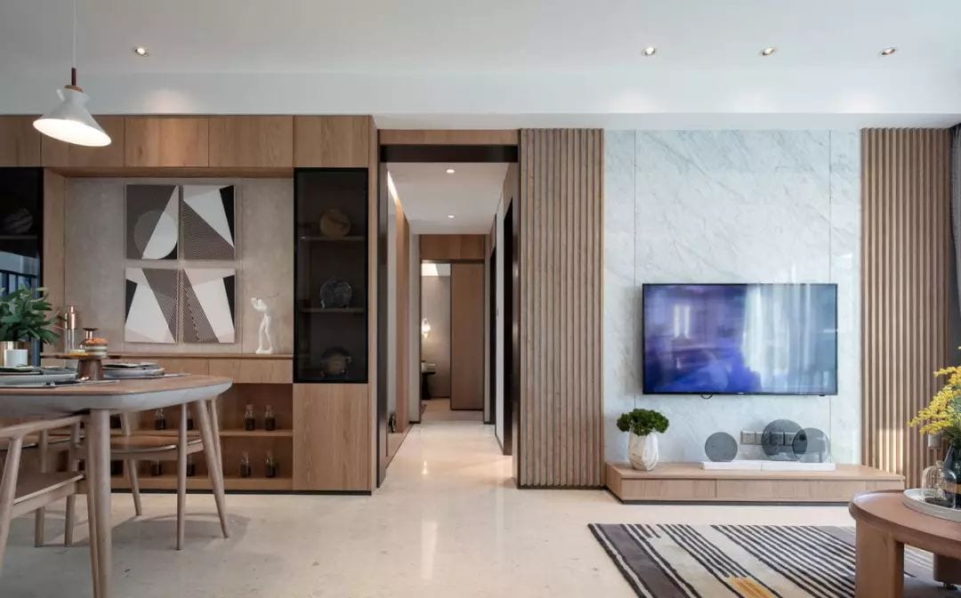
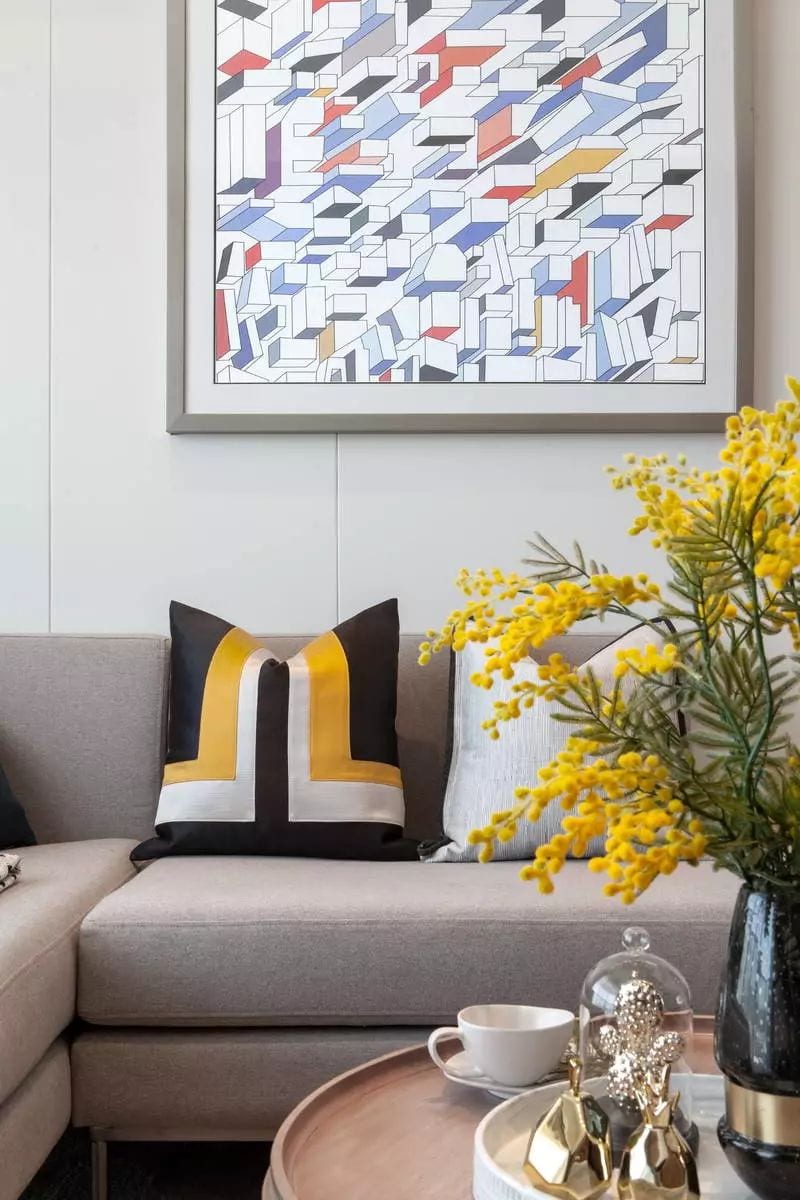
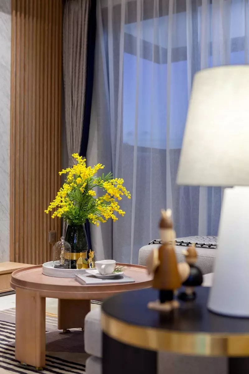
In this case, the owner is a happy family of three just born, advocating natural and comfortable leisure life. The designer strictly follows the art principle of simplism, at the same time, fully considers the functional details of the new family, and creates a modern and pure space with the simplest modeling and color. At the same time, the space function scale and the possibility of using furniture are carefully considered.
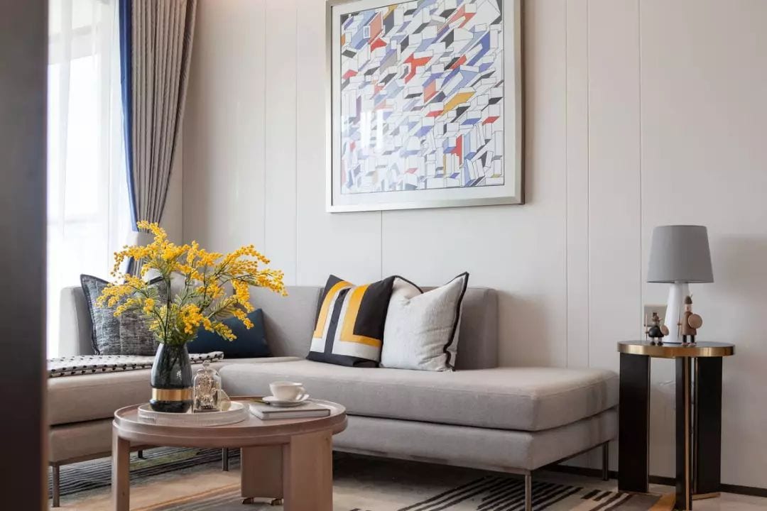
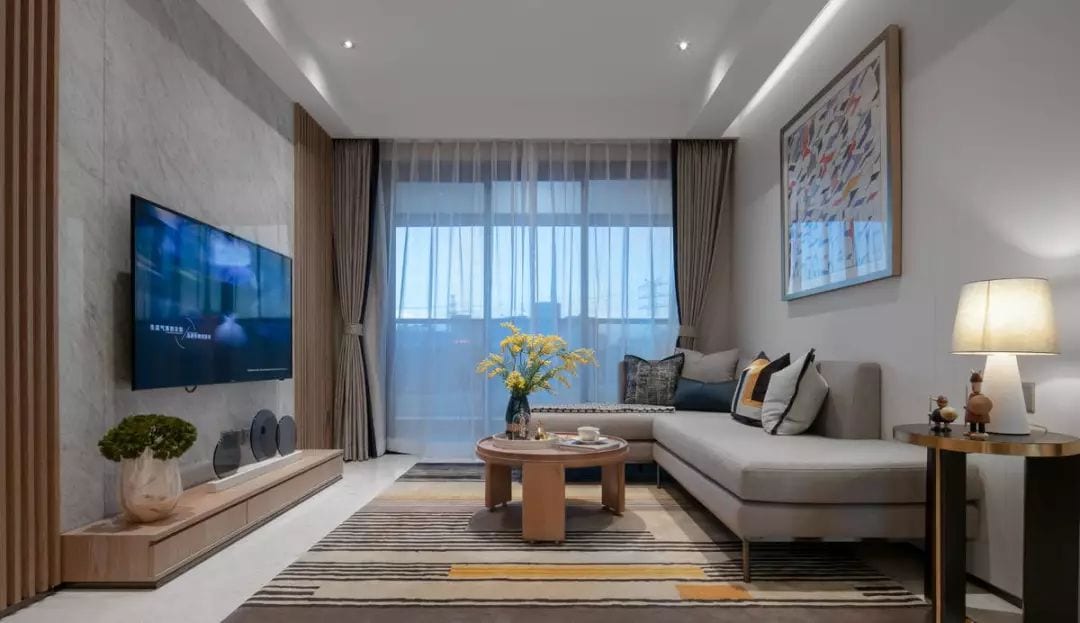
As a relatively small house type, the use of furniture pays more attention to its safety and multi-function. Such consideration can effectively enhance the living atmosphere of the space – for example, the design of the dining table and the use of fabric soft bag at the bottom can greatly reduce the possibility of children ‘ The growth of children.
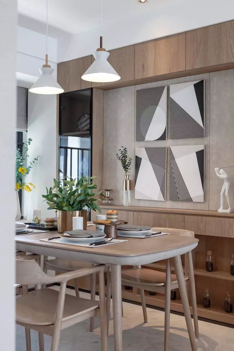
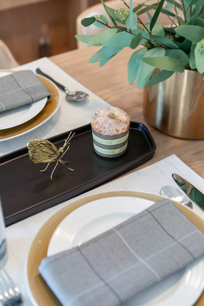
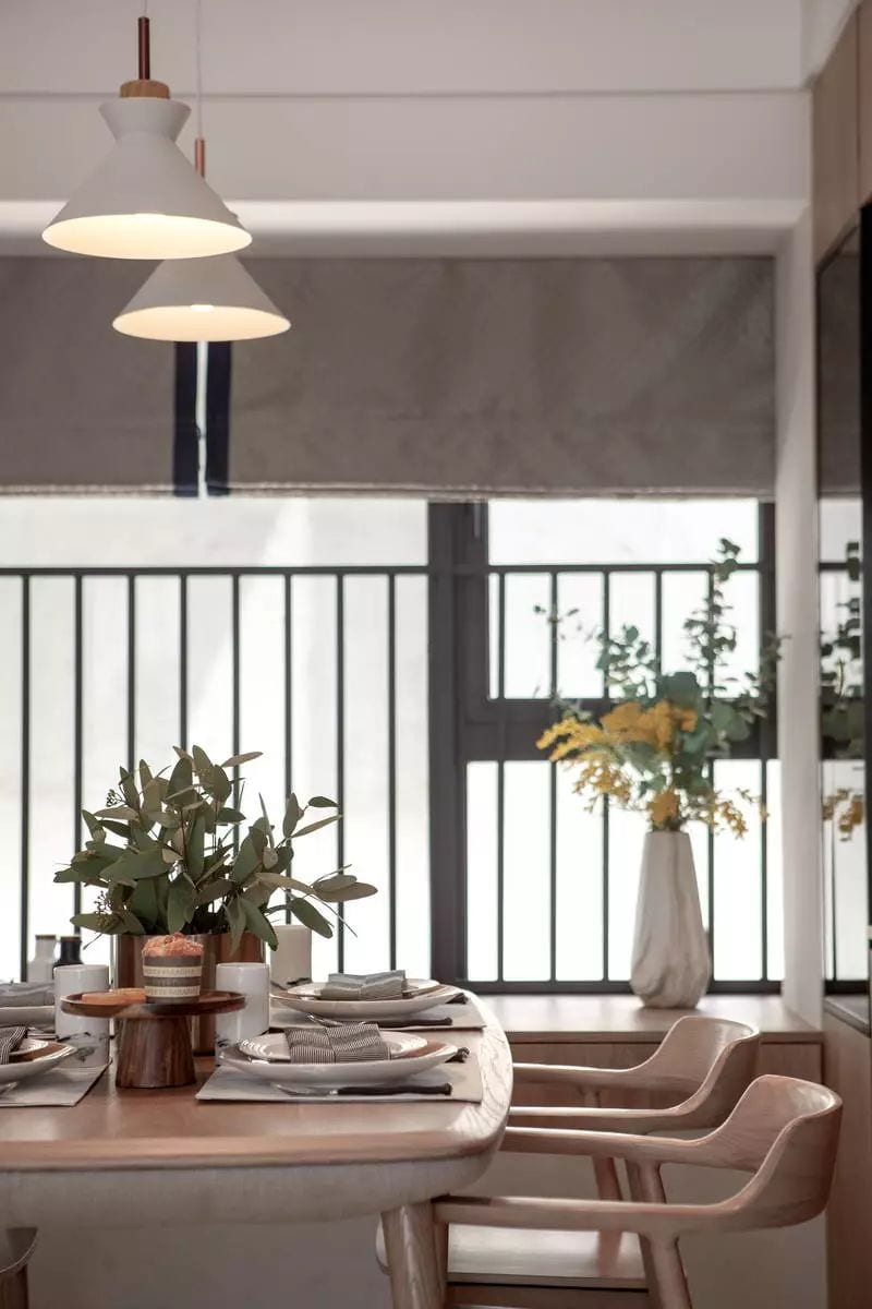
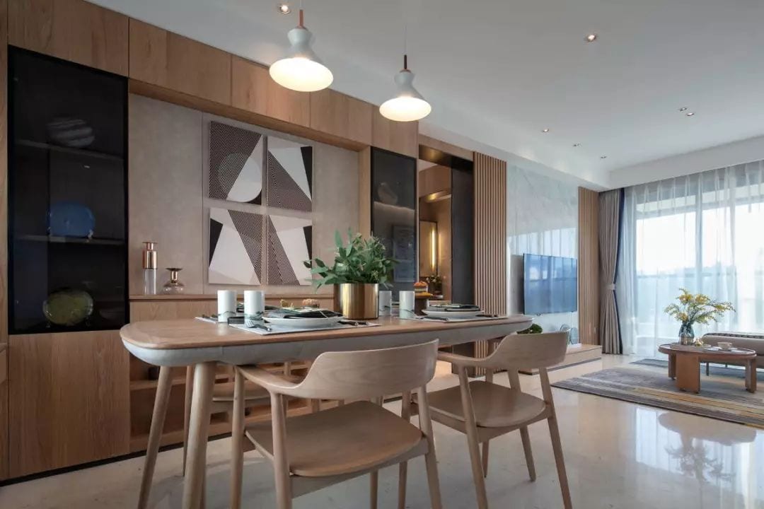
In monterian’s eyes, “the tree is straight, the sea is horizontal. Right angles are the foundation of all balance. ” In the composition of space interface, we are looking for a kind of tension to make space “grow up” through the molding of lines.
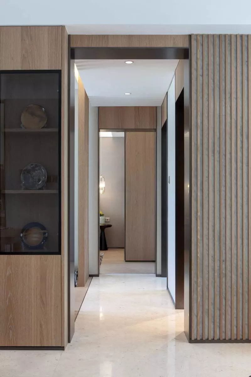
In the pure interface, the balance and aesthetic feeling of proportion are strictly sought, resulting in a simple and elegant space atmosphere with knowledge and unique taste. Similarly, in the spatial details, the proportion modulus is still strictly controlled to ensure simple but not simple spatial quality.
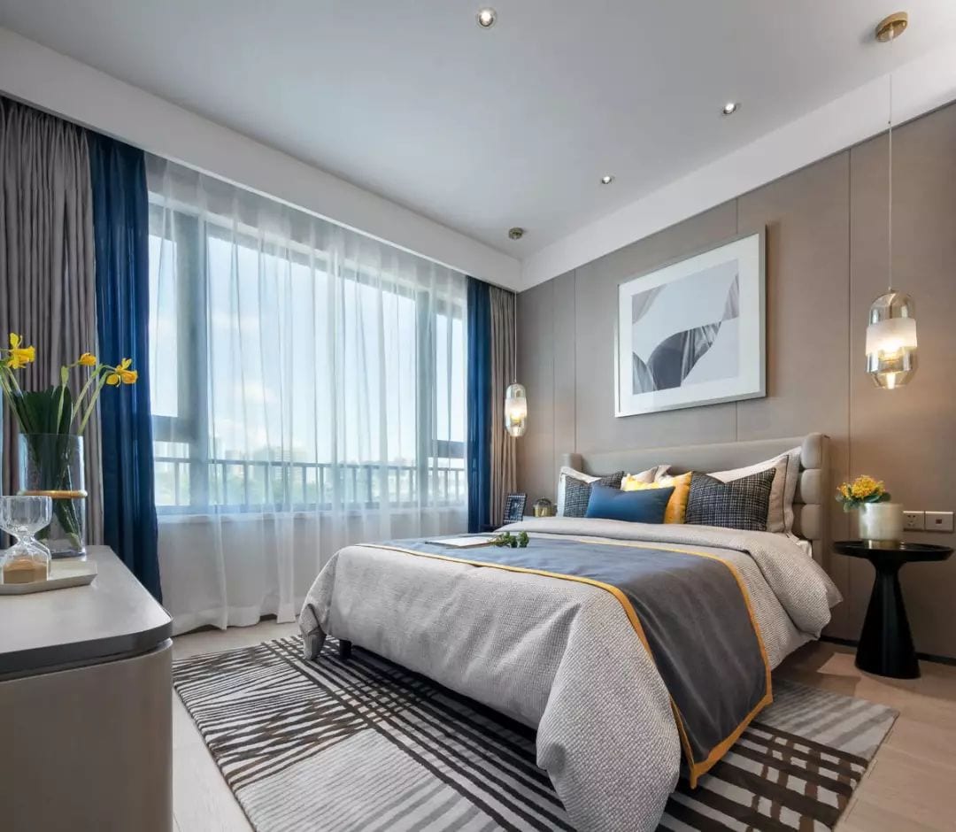
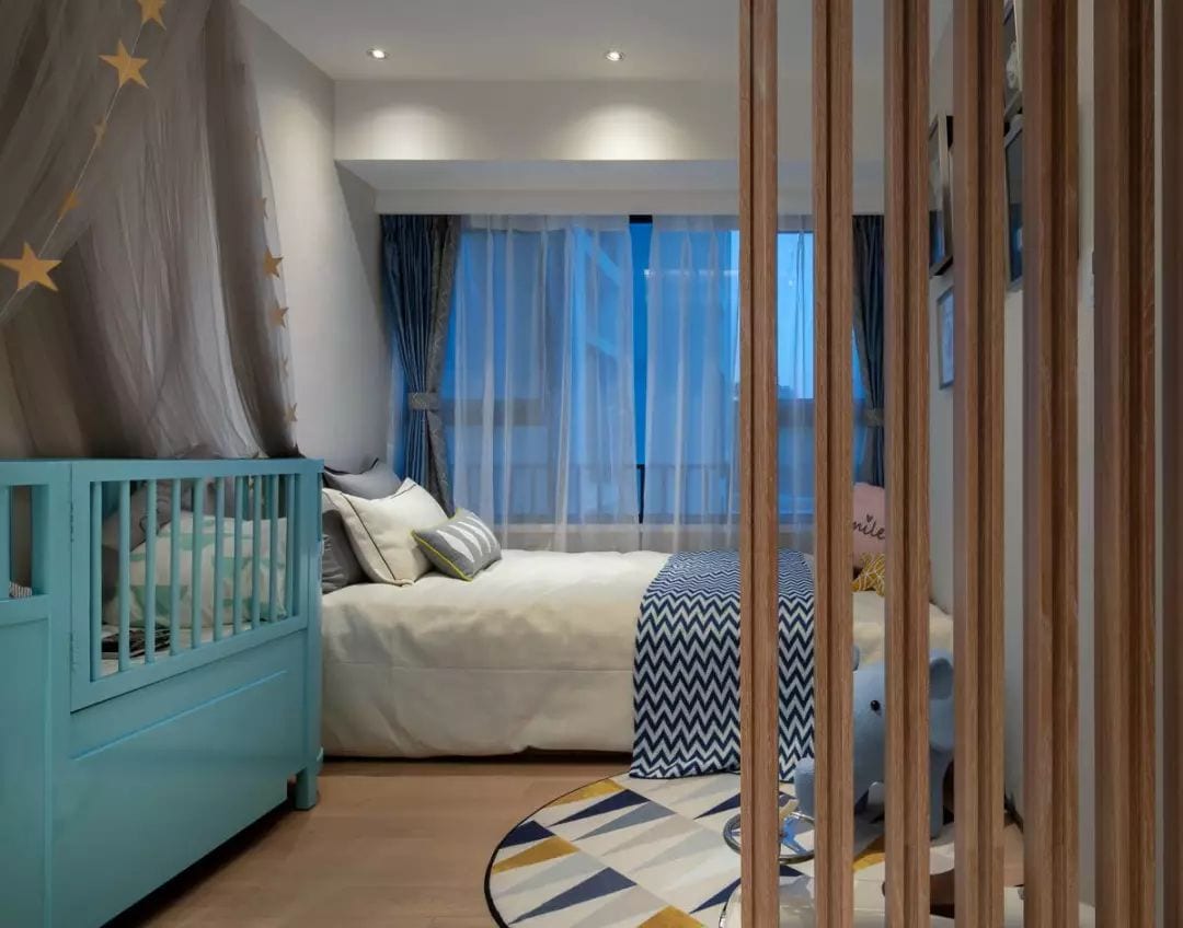
Through the open design, the children’s room has become an occasion for the owners to play and communicate with the children. At the same time, a small tatami area has been designed, which can also be used as a guest room when necessary. Even on the wall, the designer carefully arranged a cork board as a place for children’s growth.
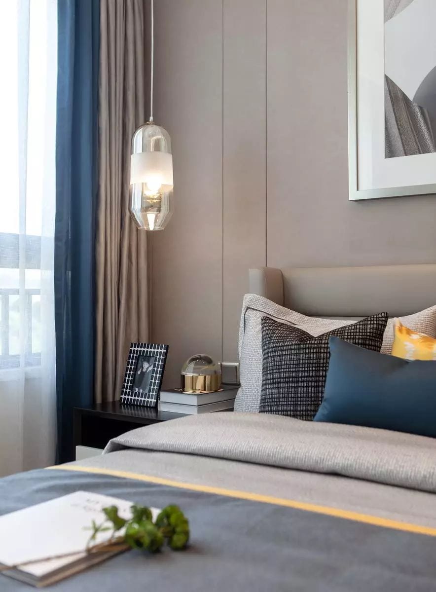
The space color of this case chooses the classic neutral color with distinct primary and secondary colors. Through the strict selection of stone and wood facing large area pavement, we can ensure that every pure interface has enough tension. But the multi-level material contrast of stone, cloth, metal and so on presents the expression of rich and lively space.
