Simple Style Space-MIX CAFE
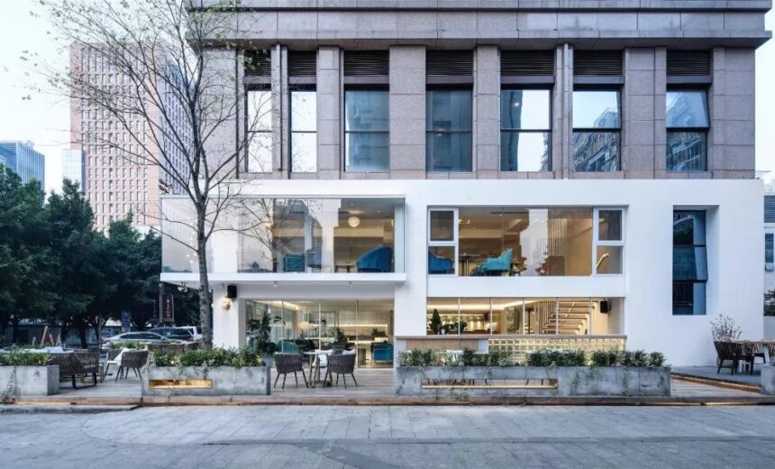
Coffee shops are not just places to relax.
Even places to spend weekend afternoons
It is also a place to observe and understand the life and culture of a region.
You can quickly learn about local life in this place.
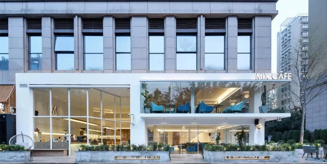
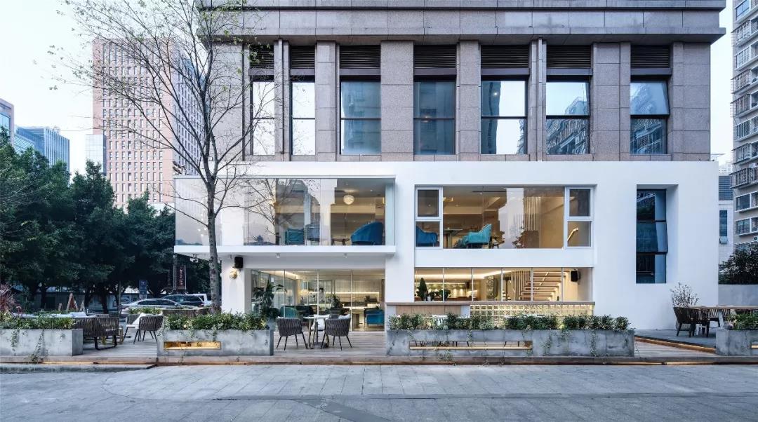
Unlike the traditional cafe’s preference for “calm dark tone” and “dark warm light”, the designer presents the whole space of MIX COFFEE in a very simple state, just as coffee emphasizes freshness, original taste, delicacy and no impurities.
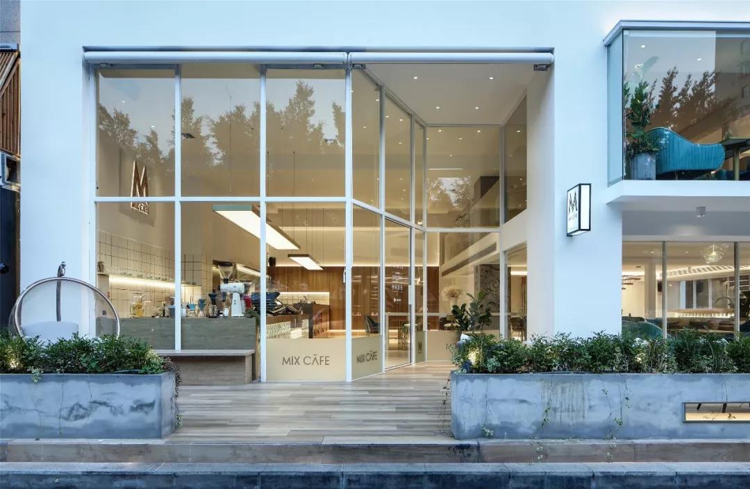
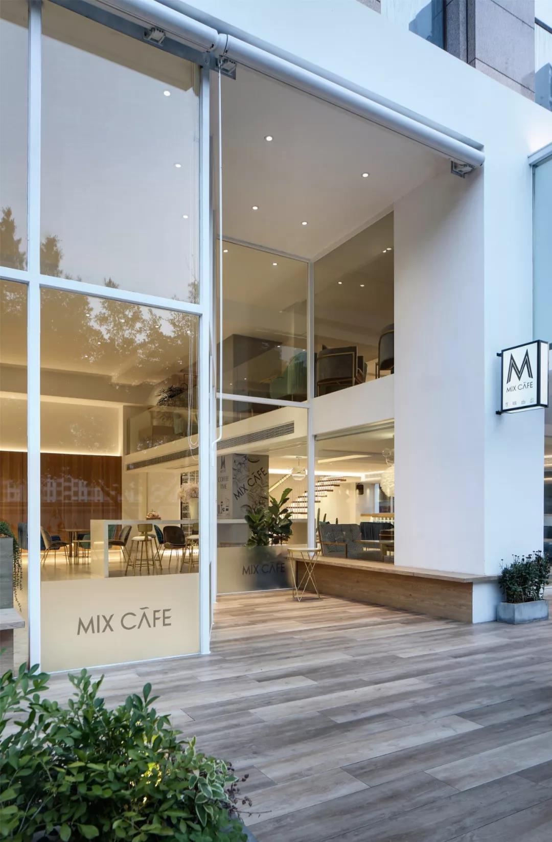
Standing outside the entrance, you can see Barry’s busy coffee barista. Perhaps that’s what it feels like to smell coffee through the glass. Initially you can see the advanced coffee machine and bean grinder displayed in the bar. The light on the coffee machine sets off a concise atmosphere.
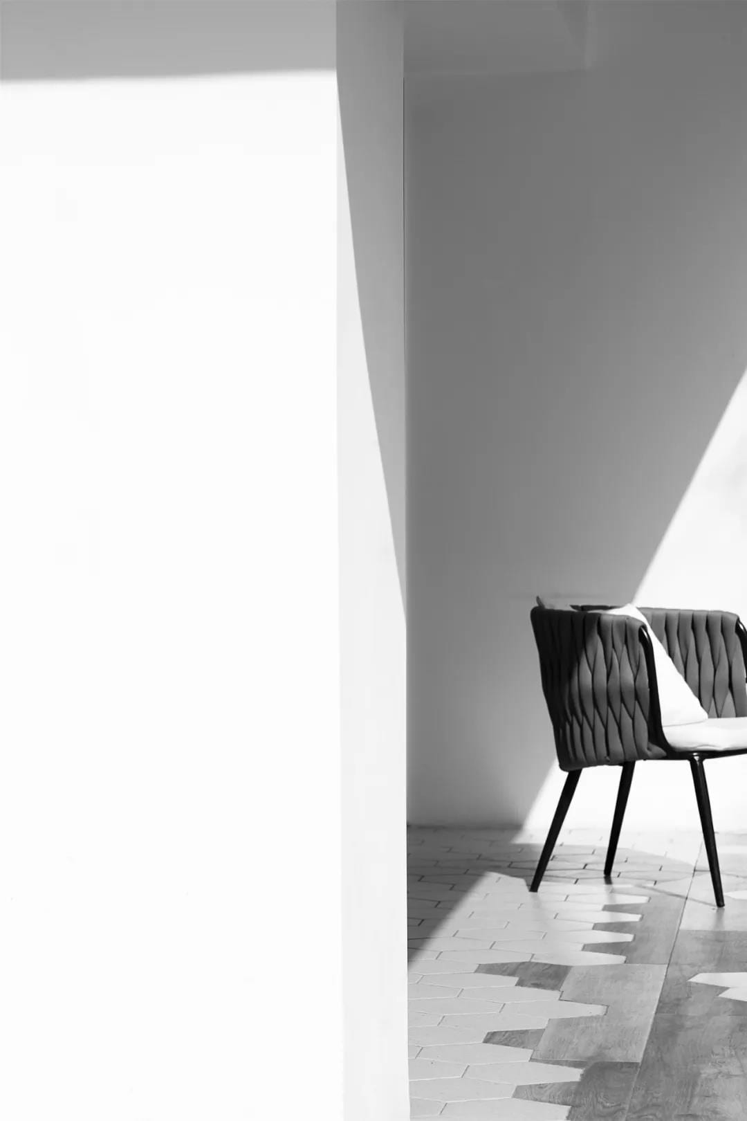
The main part of the space unifies the use of materials to create a pure space with high quality. Space by terrazzo tiles set a neutral main tone, creating a strong sense of fashion, simple and bright space, once entered, regardless of design or atmosphere, people are very fond of, no excessive color, no complex decoration. Although the store is very simple, but also cleverly used log color, adding to the temperature.
Low saturation monochrome achieves a harmonious aesthetic feeling. Without too much decoration, people can also notice the spiritual life itself, which can better reflect a high sense.
Experience area – The area is open and integrated with the coffee making area to satisfy the customers who can walk around and feel the atmosphere of coffee making. In addition, in order to make the card seat area not completely isolated, the experience area and the bar empty extension way to the card seat area.
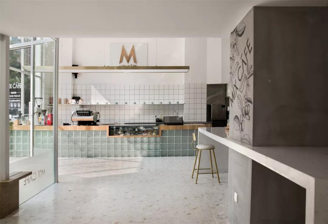
The reasonable layout of the space can not only make effective use of the space, but also let the guests feel the atmosphere of the cafe. Designers in the design of cafes in the layout of the plane, space division are fully considered.
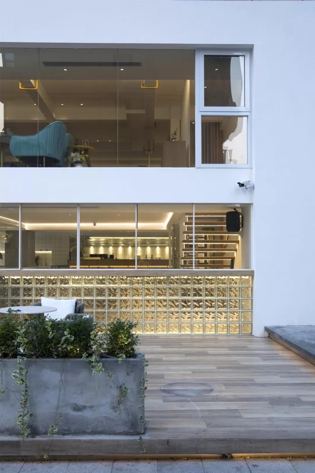
The space on the second floor is wider than that on the first floor. Many people choose to sit on it, chat and read books. When natural light penetrates through the glass, the cold cement floor becomes soft, borrowing scenery into the room, extending the space, and continuing to convey the quality to the extreme, satisfying your wanton vision of life.
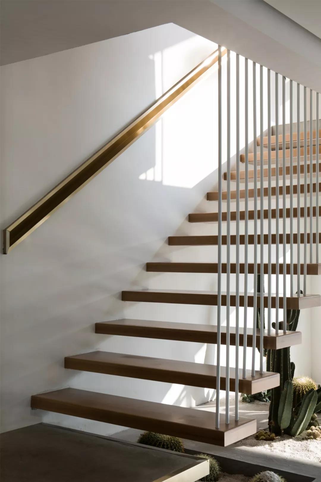
The stairs leading to the second floor space are covered with green plants, which is between the inevitable existence of stairs. Designers treat the stairs and green planting areas as the devices of indoor space, thus evolving into an eye-catching presence in the shop.
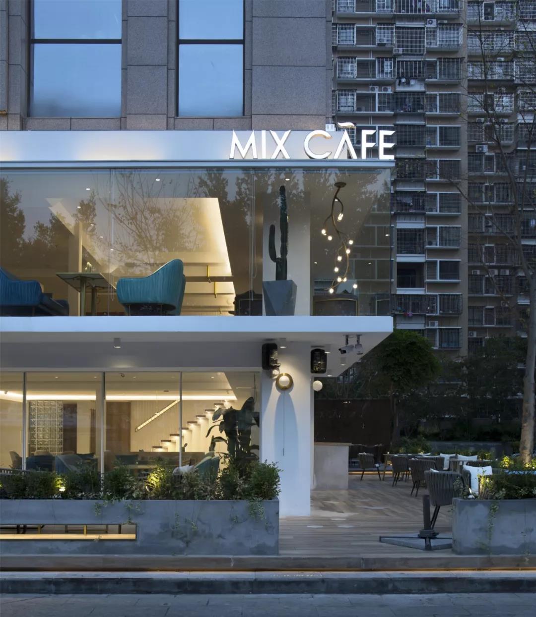
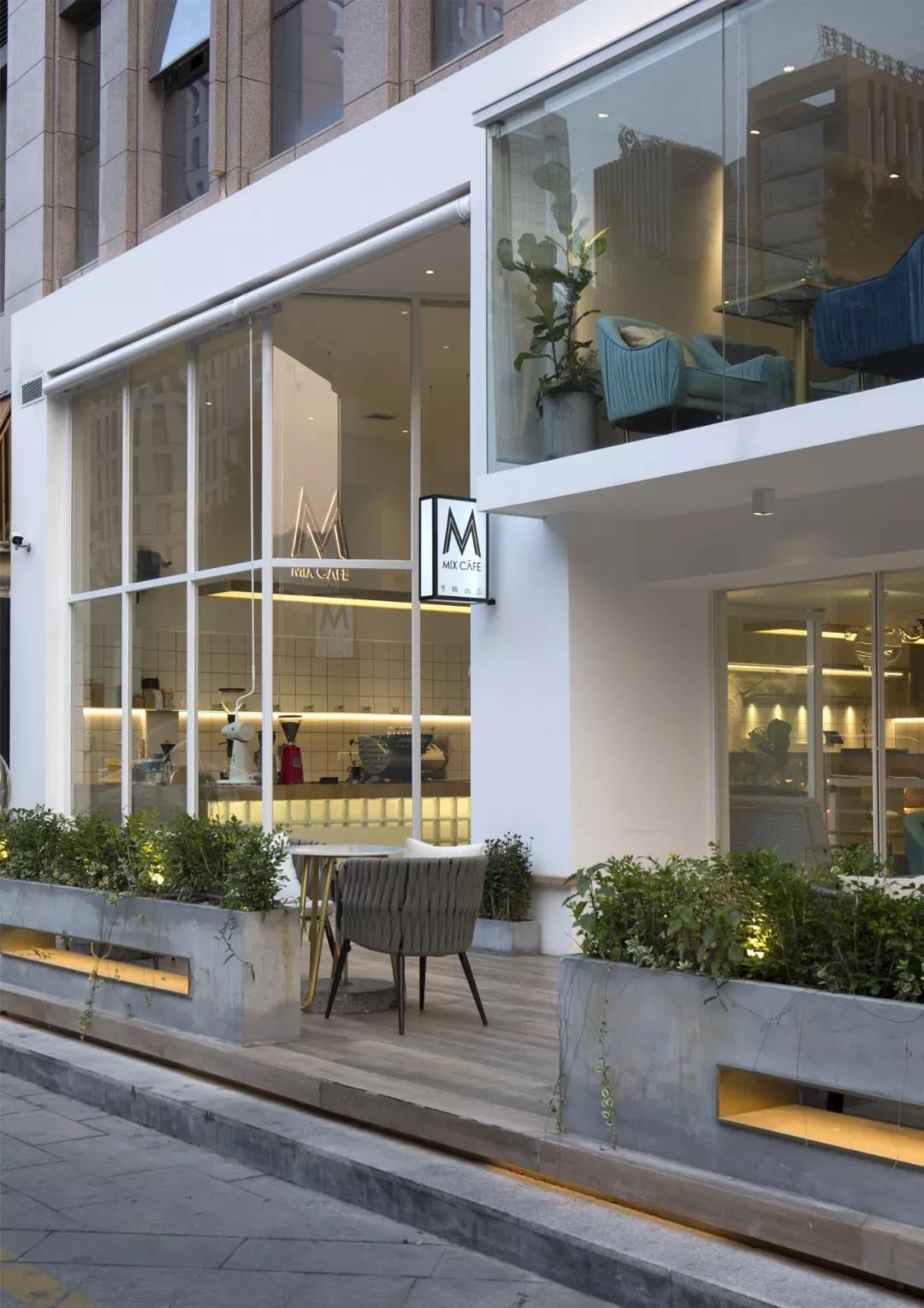
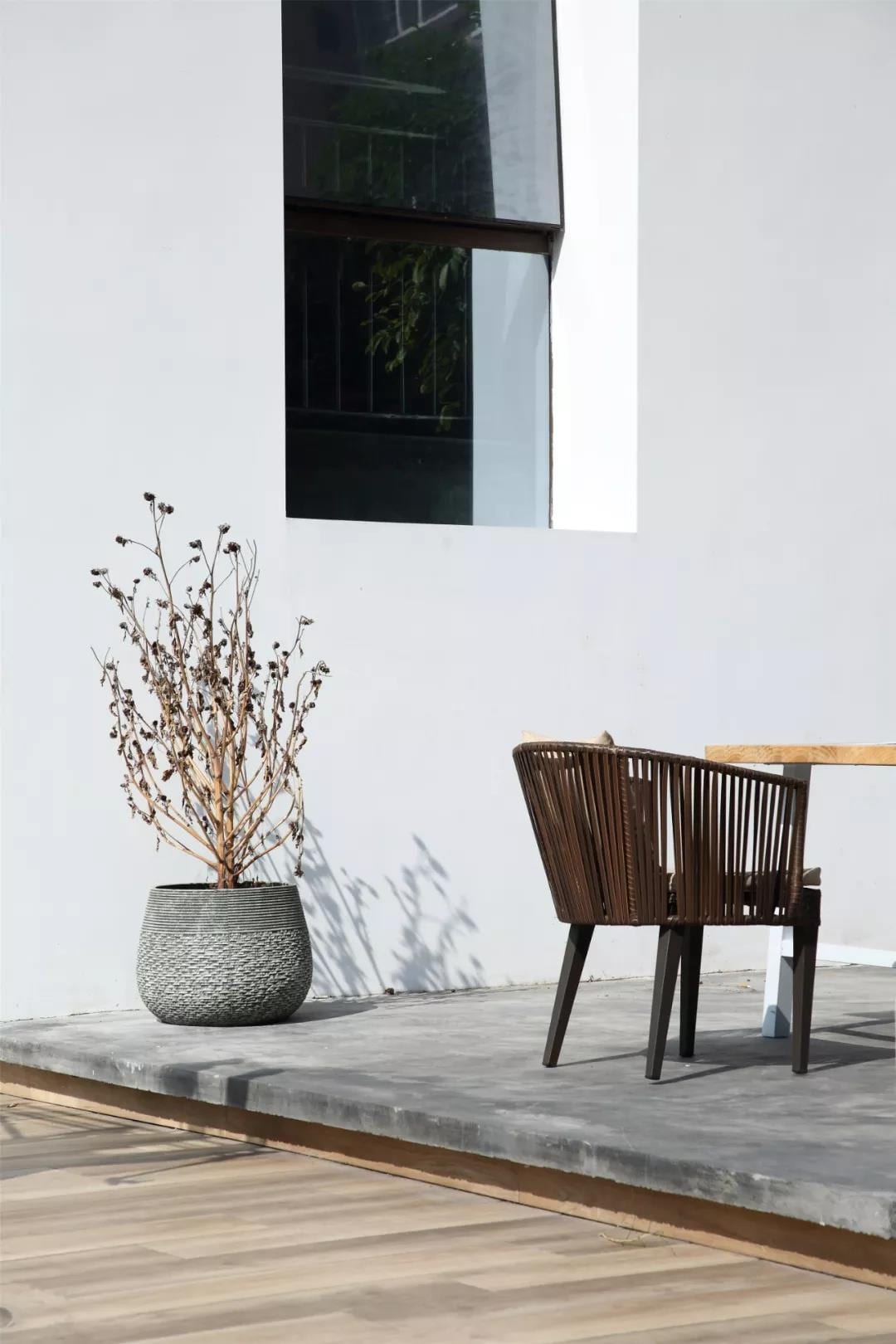
The general idea of the coffee shop is to let people have a multi-sensory journey to the attractive coffee shop. People enter the coffee shop from the area of outdoor seats, collocate with the fresh style of green plants, without complicated colors, and naturally decompress.
When the sun comes, you can call a cup of coffee to sit outside and enjoy a moment of sunbathing. The comfortable and busy life is condensed into a small cup of coffee.
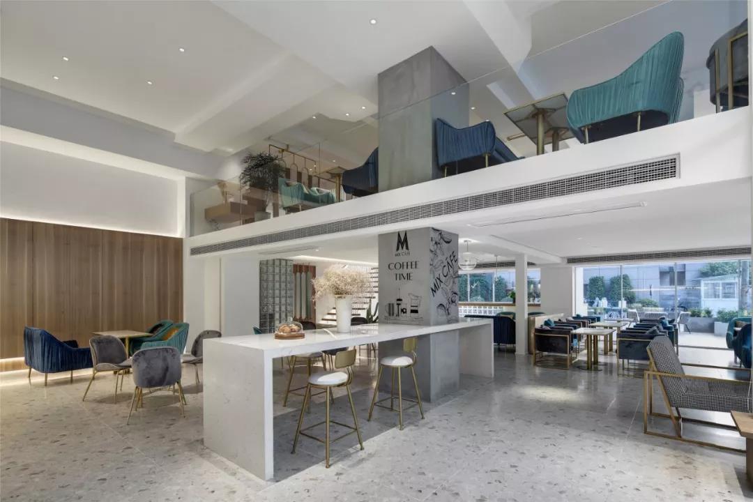
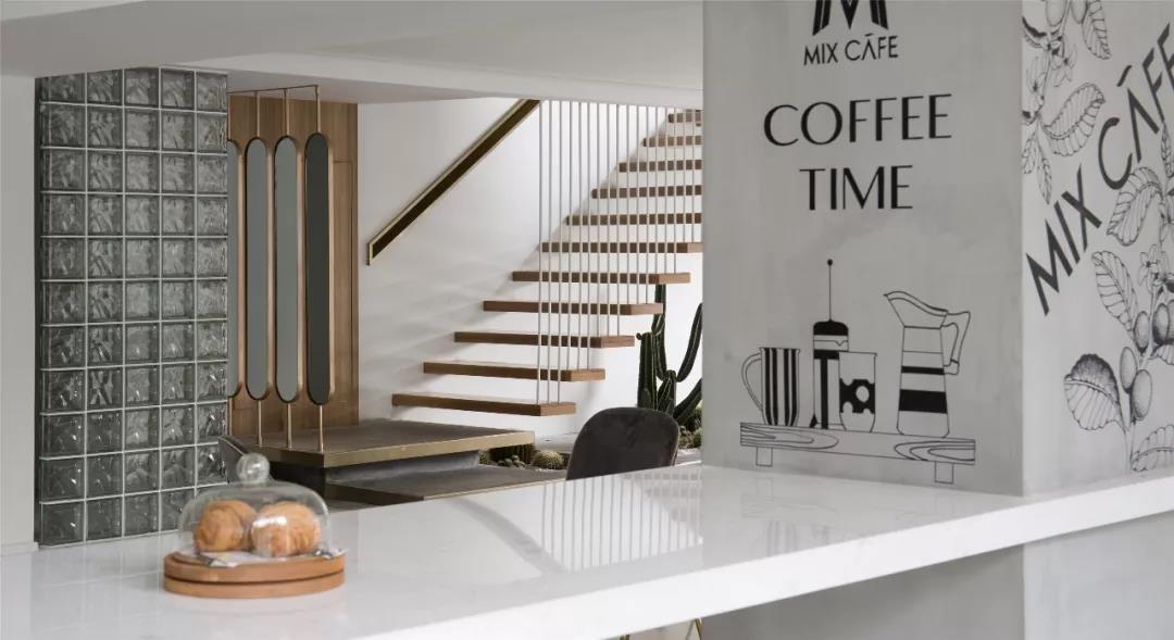
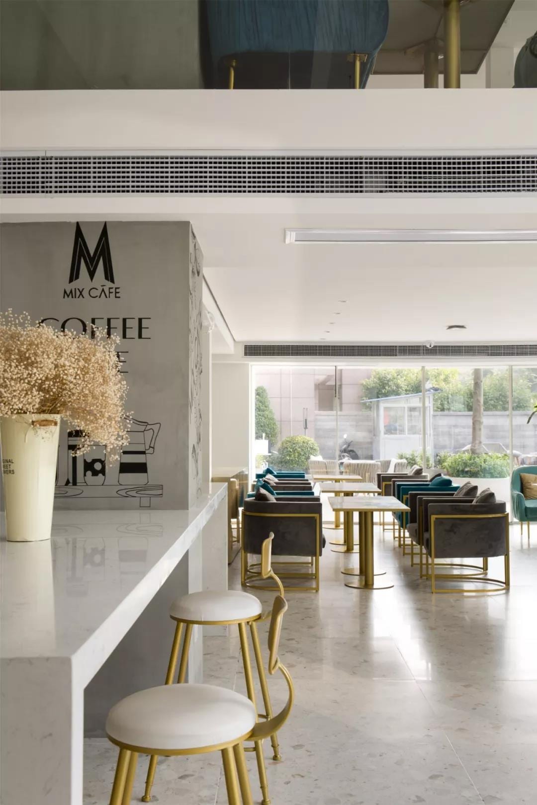
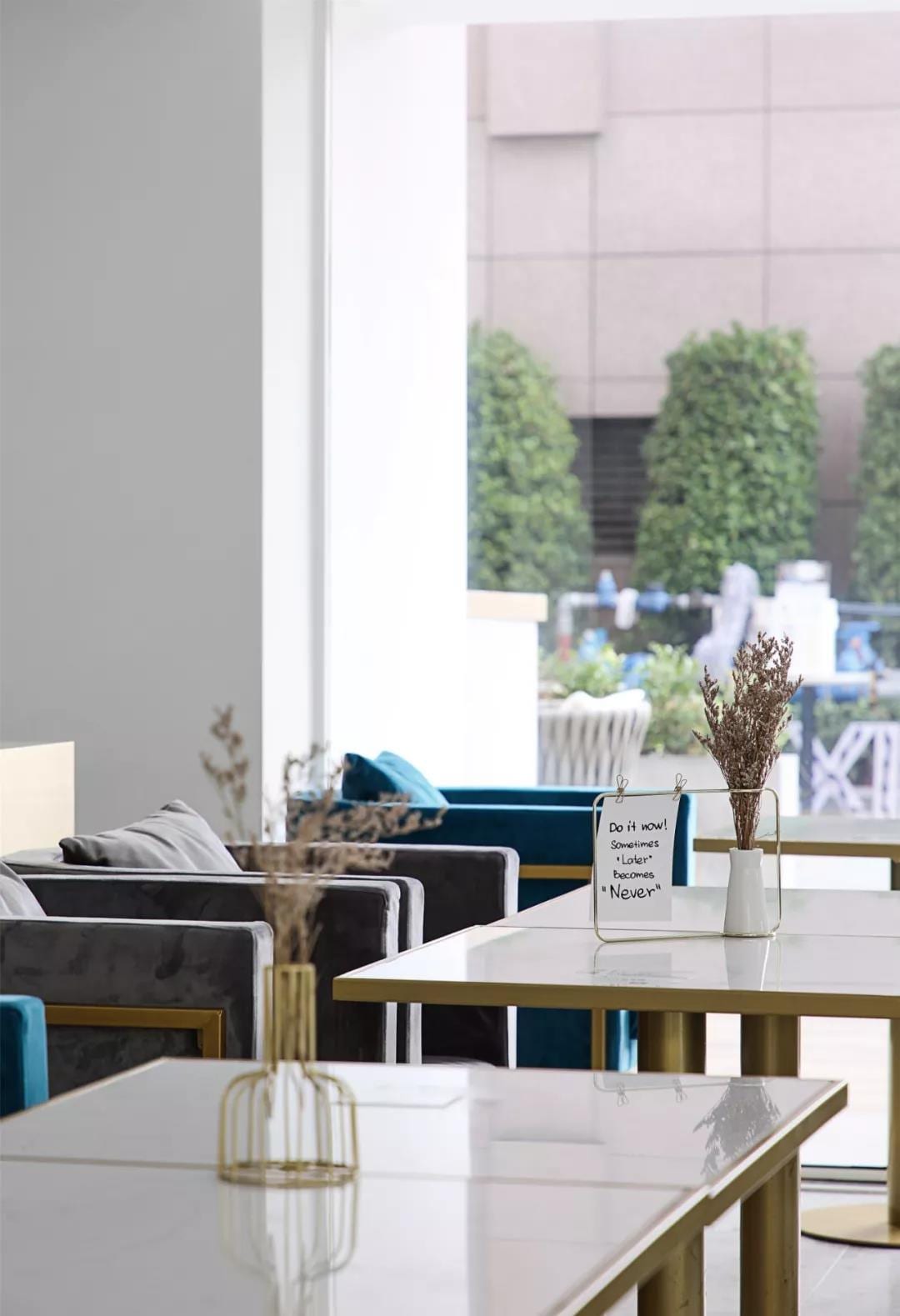
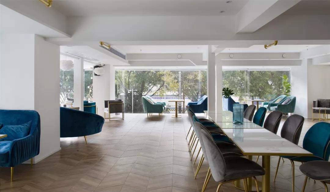
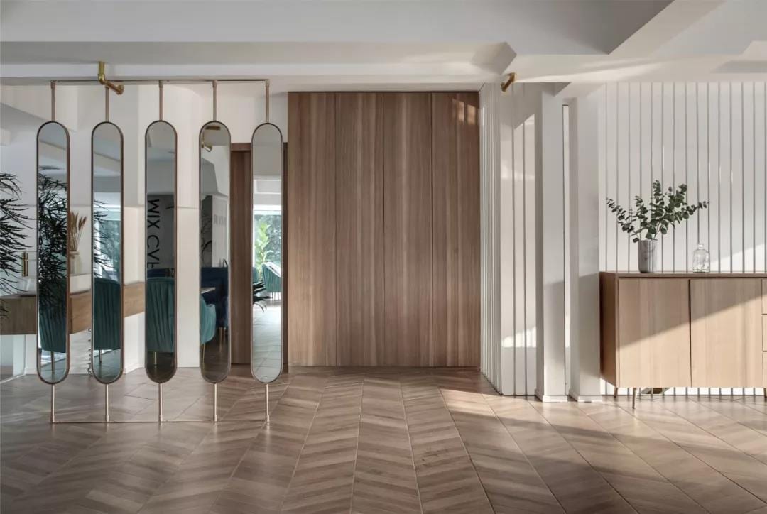
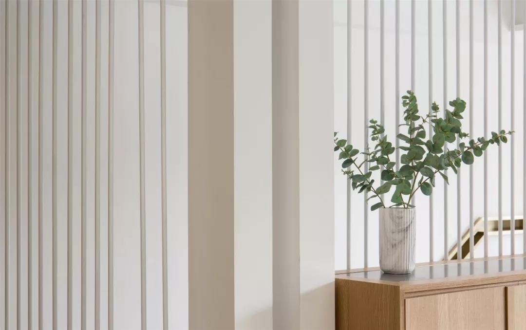
MIX COFFEE, no matter which season it is, has a fresh and clean feeling. It seems that the world in INS is not only a space for taking pictures with net red, but also a sensory experiment ground for coffee enthusiasts.
Project name: MIX CAFE
Location of the project: Longyan Wanbao Plaza, Fujian Province
Project area: 360 feet
Creative Design: Chen Yang ACE, Zhang Bin FROG
Software display: Liu Meng JESSICA
Design Team: BETWEEN Fujian Design
Construction team: detached impression
Video shooting: 1988 Photography Workshop
Main materials: terrazzo tile, wood-grain brick, Fraxinus mandshurica decorative panel, glass brick, metal pipe, titanium-gold stainless steel, Fenlin paint
Space Photography: Chen Rongkun RK. CHEN


